Consider reading our Classic Editor instructions first to cover the general process of working within WordPress. This page covers a few brief aspects of using the Block Editor. See additional resources in the sidebar of the Classic instructions page. Understand that WordPress Block development is progressing rapidly, so instructions can become outdated.
Setting up your workspace
The first thing I do (when editing a page or post) is 1) click the three vertical dots in the upper right and 2) (un)click Fullscreen mode; that makes 3) the left navigation show (on larger screens).
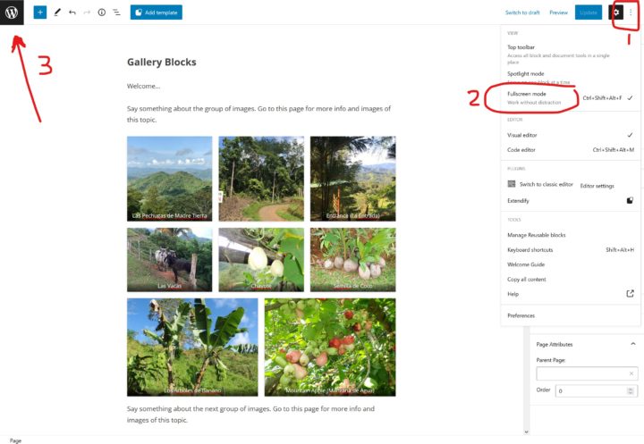
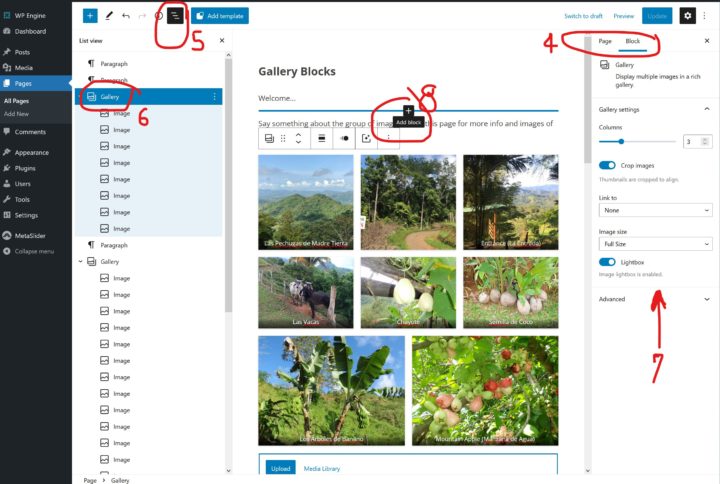
The resulting screen is shown below with the left admin nav displayed. Also in the upper right, the Settings icon (gear) will toggle the options panel. 4) The Page and Block tabs display the available options for each. The Page Block options that will appear under that tab include Permalink (which is under the Title in Classic mode), Featured Image, Parent Page, and (if enabled) Sidebar Selection.
5) Click the List View Icon (three staggered lines) to expand the page structure and assist in moving through the various contents. 6) Notice that when the Gallery Block is selected in the List View (in blue), 7) the Settings are shown and accessed under the Block tab at right.
For sites using Genesis themes, a “G” icon in the upper right can be clicked for theme options such as Layout with or without a Sidebar, although this has likely already been set by me in your theme.
8) To add more content, hover in the approximate location, watch for and click the “+” sign. The Block selector will open. Your most frequently used blocks will appear first. If you don’t see the Block you want, start typing in the search bar or click Browse All at the bottom to expand the full choice of blocks; the full list will appear at left in place of the List View.
Page Structure – “Where Am I?”
As in any “drag and drop” layout program, it can sometimes be challenging to find your place within the page amongst all the blocks. This challenge is not unique to WordPress; you can end up with blocks inside of blocks unintentionally in any system.
You may not be sure, for example, whether you are within a column block or below the entire block. To find your place easily, expand the “List View” icon (#5 above) to display the Block navigation/structure at left, and that will help locate.
New, very helpful features of the List View in the latest update (5.9+):
- ability to drag and drop within the structure,
- hover over a block and click the three-dots at right for options such as duplicate or delete.
Populating Your Page or Post
To add a block, put your cursor approximately where you want to be within the Page content. You will likely see one or more “plus” signs appear to allow adding a new block. Click the “+” and add your block, reviewing #8 above if needed.
In a paragraph flow such as this part of this page, you can hit an “enter” at the end of a paragraph and select a new block.
Within the page content, a highlighted block can be moved with the Drag and Drop handle, second icon from left in its icon bar, or with arrows, third icon from left. Blocks can now be moved or deleted in the List View as well.
The “+” sign, upper left, to the left of the List View icon, opens the entire tool chest of Blocks, Patterns, and Reusable Blocks (if any).
The entire page can be single column, populated typically by headings, paragraphs, and perhaps a list or images—the most commonly used blocks. In fact, some pages carried over from a previous website might be presented in a “Classic” Block where all formatting is done in the icon bar above rather than in the sidebar with Block options. A Classic block can easily be converted to blocks when more flexibility is desired.
For ease of navigation withing a Blog (News), I would typically set up your website with a sidebar populated with widgets.
For other pages, not part of the blog or news, it is best now to use columns. Insert a Column Block and then fill it with containers and/or groups, and inside of those insert paragraphs, images, lists, etc. This page is full width so very wide images can be displayed. Groups are handy when you want to move sensible groupings around to test various layouts or orders. A typical way to group, if you didn’t start with a group block, is to click a sub-heading, hold the shift key, then click the last paragraph in that group, then click the three-dot option icon at right and click “group.”
Images may be added to your Pages and Posts in several ways: 1) within the content as a separate block, 2) within a paragraph as inline (under the dropdown arrow), or 3) as a Featured image to be display at/near the top of the page/post. You may add images first to the Media Library or add them “on the fly” within a Post from your hard drive or by pasting in a screenshot.
PDFs can be added in multiple ways as well.
- If you need a PDF or other document available from your post, you may upload this in the same manner as an image, directly to the Media Library or from within a post. Once uploaded, click Copy URL in the sidebar.**
- The way it displays in a post will be significantly different depending on how you insert it. If you insert it between paragraphs, it will display a thumbnail image. To insert inline within a paragraph (recommended), type the words you wish to link, highlight them, click the “link” icon in the toolbar, **paste the URL that you copied, click the “submit” arrow.
- Additionally, best if you open PDFs in a new window so that people don’t close them when done and accidentally leave/close the website. Single click on the newly inserted link. A hover box will appear with the link. Click “the Edit/pencil icon, then the gear for Link Options. In the next box that opens, under the URL and Title, click “Open in new tab.”
For emphasis and understanding, I have coded the remainder of this page to show each of the Blocks (along with “figures” and “divs” within them) when you hover with your mouse.
The following block is a Table:
| Row 1 Column 1 | Row 1 Column 2 | Row 1 Column 3 |
| Row 2 Column 1 | Row 2 Column 2 | Row 2 Column 3 |
| Row 3 Column 1 | Row 3 Column 2 | Row 3 Column 3 |
Tables will maintain their rows and columns even on small devices, check it out.
Columns can be very useful as a means of housing various blocks and providing the ability to drag and drop with a more creative result. However, balancing content in columns for appealing display on all device sizes can be a bit challenging; for this reason I often “align” an image within text content rather than placing the two in columns. Note how the columns stack on small devices, so order the content by importance and flow. Perhaps a second column block will help with additional content flow (so that your columns flow left right left right rather than long left long right). Blocks can be specified as regular, wide, or full width in some themes. Take a look at how the columns flow on mobile vs. how the table cells above don’t flow.
Following is a (regular) Column block, ironically the tool that allows specified percentage widths and a fixed margin between.
Text in first column of Column block, 25%.

Text in third column of Column block, 25%.
Following is an Advanced Column block which allows variable margin between but only specified column percentages. Either of these column blocks allows wide or full width when the theme supports that feature.
Narrow first column.
Narrow second column.
Wider third column.
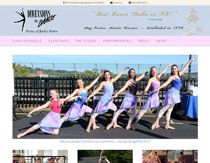
Following are two versions of “Media & Text” blocks. The first, within the “Layout Elements” block choices, simply floats an image to one side of a paragraph. Delete and change what you don’t want.
Content side of Media & Text
The second, within the Genesis Blocks “Layouts” block choices, or the icon at top left in the admin, includes some preformatted text and an image, each in a column, and can be set to align wide or align full width for visual variety. Additionally, because it is within columns, the margins and padding can be specified.

Content side of Media & Text
Margin and padding can be set at right in block settings.
Following is a full width Image:

Text can be modified using settings at right under the Block tab. Your developer can pre-set theme colors in the palette or define CSS classes if you request. A CSS class can be a way of adding font styling, a background, or border to a type of content, similarly to how “Quote” and “Testimonial” styling is already predefined within blocks.
Everything looks great. I’m really pleased with the Resort Wear site.
Peter Wilson
Kaleidoscope ImprintsInjustice anywhere is a threat to justice everywhere.
Martin Luther King Jr.
The following block is a YouTube embed. Simply copy the URL and a visual snippet will be shown:
The above YouTube embed will automatically render at approximately only 500px wide. To show it the full width of your content column or page width, use a Custom HTML Block instead and change the width and height as appropriate. For example, a 4/3 aspect ratio might be 840px wide and 630px high, or a 16/9 aspect ratio might be 1140px wide and 640px high. This page explains more detail about getting what you need from YouTube in “2. Use Embed Codes to Create iFrames:” https://kinsta.com/blog/wordpress-iframe/
The following block is a WordPress site embed:
The following is a Twitter embed:
Follow Us on Facebook